
New York Traffic Collisions 2015-2017
Basic Stats - Machine Learning - Geoplotting - d3.js Visualization
The following analysis is a final project created by two master students during the spring semester
2017 in the course (02806) Social data analysis and visualization, run by Sune Lehmann and the Technical University of Denmark.
The main topics of the course, besides python programming, are machine learning and data visualization (D3.js). The project has hence been thought out to leverage the techniques we've learned in those topics.
While traffic collisions have a significant impact on our lives the current analysis focuses on exploring the Data collected by NYPD and published by NYC OpenData during 2015-2017. Furthermore data from N.Y. yellow taxi used to estimate the traffic areas and correlate them to the accident sites. Our purpose is to find out why accidents happen and help to prevent them.
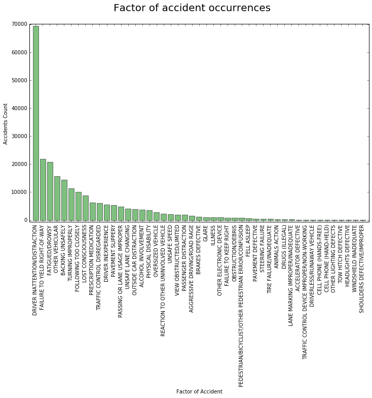
Accident Factors
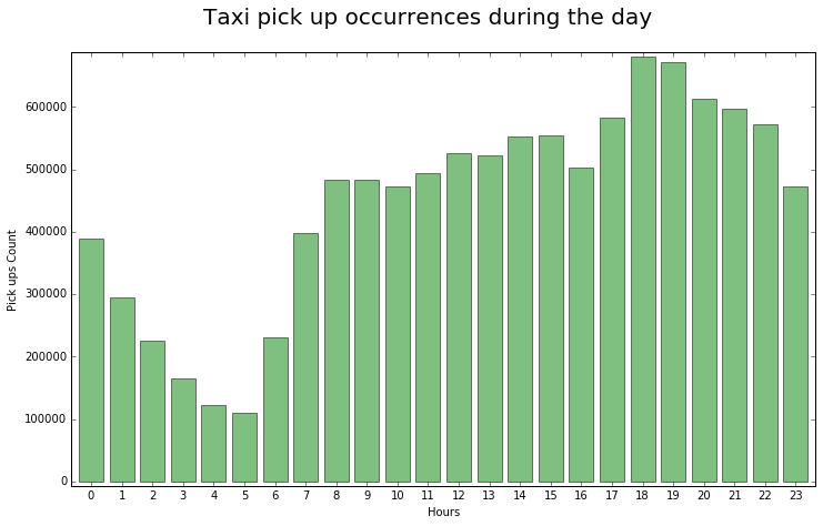
Traffic during the day
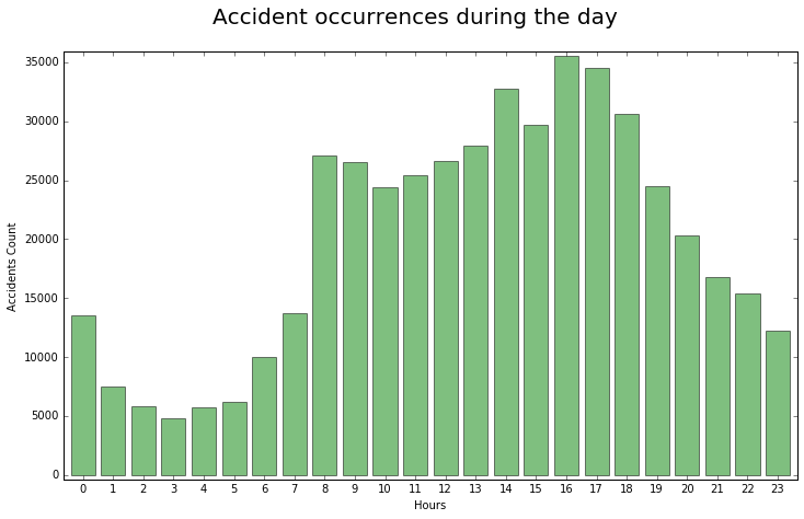
Accidents during the day
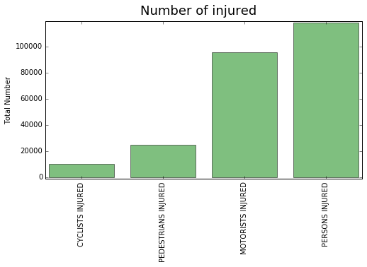
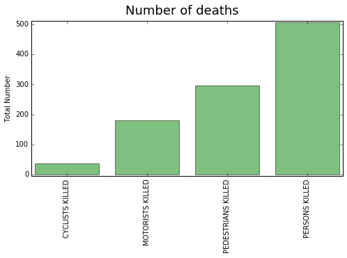
Injured
Killed
The following Scatter Plot shows the 10 most frequent factors of car collisions. Click on each circle to get info for the borough with the most accidents of the specific factor.
100
Motorists Injured
Cyclists Injured
Pedestians Injured
Motorists Killed
Cyclists Killed
Pedestrians Killed
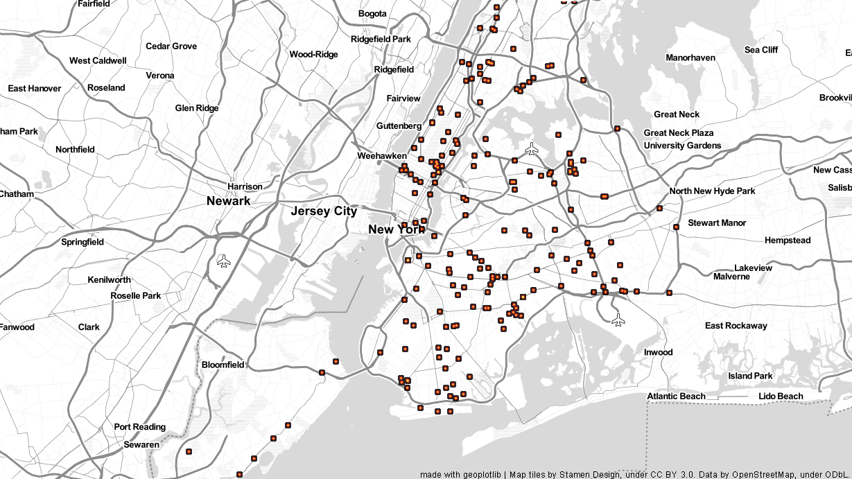
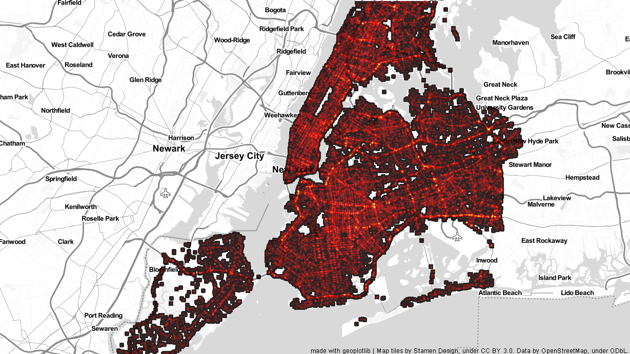
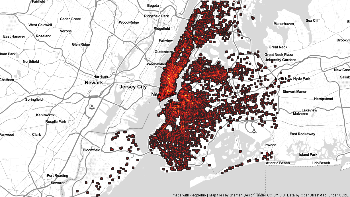
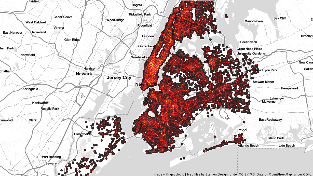
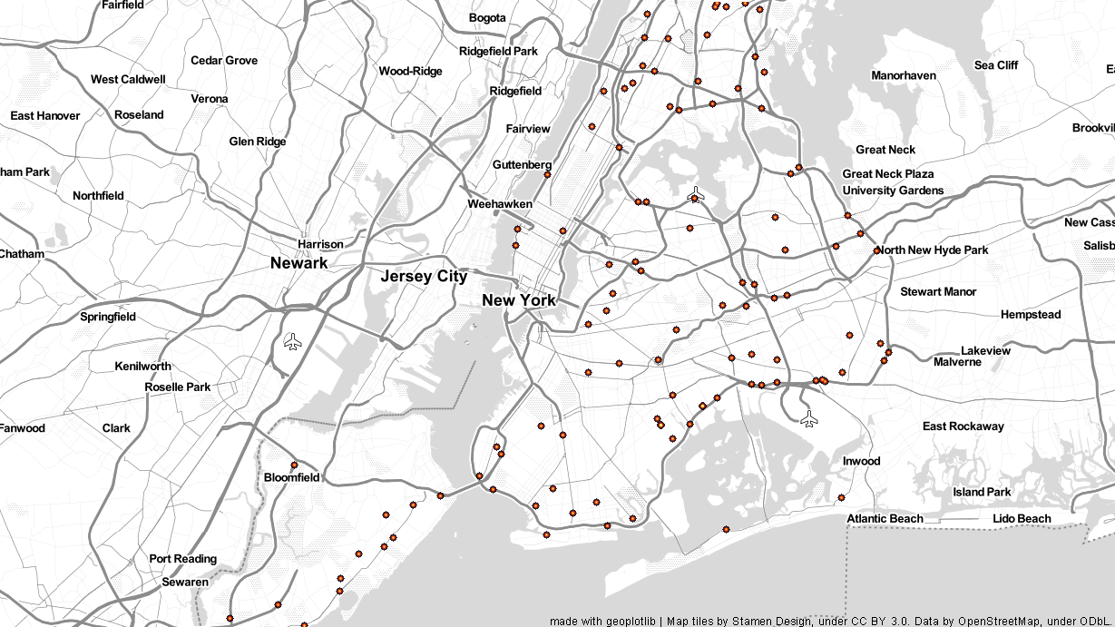
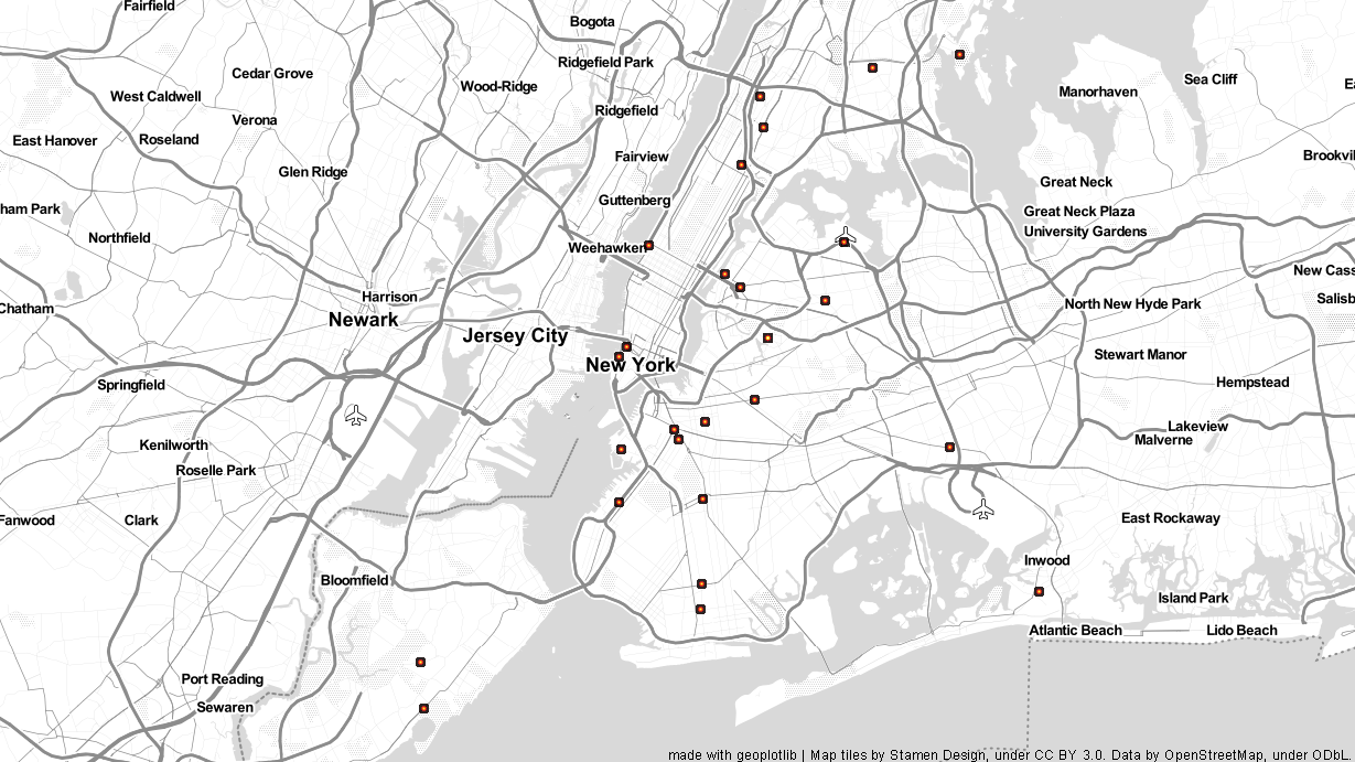
Performing Kmeans clustering to all the collision incidents allowed us to define the centroids for 2, 3 and 4 clusters as shown below with red circles. The same actions performed on the yellow taxis pickup data of January ,shown below with blue colour, in order to find out if there is any correlation of the traffic and accidents areas. Hover over the buttons to preview or click to explore the results.
We are thrilled that we met our expectations for the project. We managed
to get an insight of the N.Y. traffic collision and provide to the user the ability to
see the basic stats, get an overview of the most frequent factors of accidents, the borough
that they occure and how the accidents spread during the day. Taking in consideration the pick up -
drop off taxi data we made a D3.js geo plot presenting the centroids of the clustering both
for accidents and traffic.
Another very interesting machine learning technique was implemented. The decision tree classification, that can predict
where an
accident occured given the factor, time and the type of the vehicle, can be found on the Jupyter notebook.
For a more detailed analysis as well as our own denouements please
check out our Jupyter Notebook on NBviewer bellow.